
My Palette
My Palette
what colors do I use most often?
Watercolor Paint
"What colors do you use?" This is a question I get asked often in my classes. I too love to know what colors/brands other artists use in their palettes and why.
I will answer from my experience. This is what I know thus far, I still have much to learn about paints and colors. My current palette is not necessarily the "right" way to set up your palette. It is a personal preference and I encourage you to try out different colors and brands to find what excites you.
Use Professional Grade Watercolor Paint
What brand? Any professional grade paint is a good choice. Here is a list of some brands of professional grade watercolors. For greater depth in the differences between them, read this.
Holbein
M Graham
Windsor and Newton
Daniel Smith
Grumbacher
Sennelier
Not all colors look the same in different brands. You may find you prefer ultra marine blue in the Windsor and Newton brand as opposed to M Graham brand. While your favorite lemon yellow may be in the Holbein line of paints. My palette is mostly Windsor and Newton. I have not tried all the brands, I have landed on Windsor and Newton, especially their burnt sienna and have stayed pretty brand loyal to them. However I plan to experiment with more brands to discover the differences between them for myself.
A good color plan to recreate in your palette is to have a warm and a cool in each of the primary colors. A note about warm and cool colors. Not all yellows are warm and not all blues are cool. As with all colors there is a warm version and a cool version. Even in blacks you can have a warm black and a cool black. I encourage you to do some research on this and make a color journal with your paints. Make notes about the brand, color, temperature, transparency, staining etc. Mix different combinations and log the colors and the actual paint swatches in your journal (use a watercolor paper journal).
Warm color appears to move forward while cooler colors recede into the background. That's why when painting a landscape it translates reality to use warm colors in the foreground then move to cooler colors and lighter values (meaning more water) in the background. If a subject is mostly warm, use a cool shadow, if your subject is mostly cool then use a warm shadow. If you want the most brilliant color results you need to mix cool colors with cool colors and warm colors with warm colors. Keep in mind there are areas in your painting where you may not want it to be the most brilliant.
Here is a list of paints according to their temperature:
Warm Colors
Cadmium Yellow Pale, New Gamboge, Cadmium Yellow, Winsor Yellow Deep, Indian Yellow, Cadmium Yellow Deep, Cadmium Orange, Winsor Orange, Winsor Orange (Red Shade). Cadmium Scarlet, Scarlet Lake, Cadmium Red, Winsor Red, Rose Doré, Quinacridone Red, Opera Rose, Quinacridone Magenta, Permanent Magenta, Cobalt Violet, Permanent Mauve, Winsor Violet (Dioxazine), Cobalt Blue Deep, French Ultramarine, Ultramarine, (Green Shade), Winsor Blue (Red Shade), Cerulean Blue (Red Shade), Winsor Green (Yellow Shade), Yellow Ochre, Gold Ochre, Quinacridone Gold, Brown Ochre, Magnesium Brown, Burnt Sienna, Light Red, Venetian Red, Brown Madder, Perylene Maroon, Perylene Violet, Burnt Umber, Vandyke Brown, Sepia
Cool Colors
Lemon Yellow, (Nickel Titanate), Bismuth Yellow, Cadmium Lemon, Winsor Lemon, Lemon Yellow Deep, Transparent Yellow, Winsor Red Deep, Permanent Alizarin, Crimson, Alizarin Crimson, Permanent Carmine, Permanent Rose, Rose Madder Genuine, Indanthrene Blue, Cobalt Blue, Antwerp Blue, Prussian Blue, Winsor Blue (Green Shade), Cerulean Blue, Phthalo Turquoise, Winsor Green, (Blue Shade), Terre Verte, Perylene Green, Permanent Sap Green, Olive Green, Terre Verte (Yellow Shade), Green Gold, Raw Sienna, Indian Yellow
A resource from Gamblin about temperatures of color.
Windsor and Newton professional watercolor chart.
For more advanced details about colors/paint descriptions from Keene Wilson go here,... a great reference on color for certain subjects, transparency, staining etc...

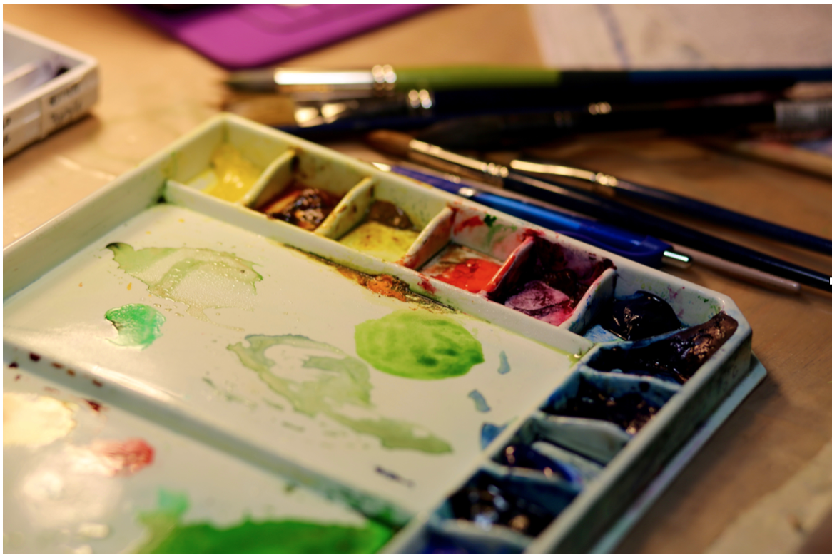
My Current Palette
This is my current palette. It does get tweaked every now and then, however I will list my colors in order of preference.
Quinn Gold
Burnt Sienna
Ultramarine Blue
Sap Green or Hookers Green
Opera Rose
Alizerin Crimson
Indian Yellow
Transparent yellow - Aureolin - Lemon yellow
Indigo
Cadmium Red
Raw Sienna
Green Gold
Windsor Blue
Prussian Blue
Cobolt Blue
Cobolt Turquoise
Phthalo Blue
Raw Umber
Burnt Umber
How I set up My Palette
I like to label my palette with the color information on medical tape (it can handle getting wet). The tape can be easily removed if and when I change colors in the well. Some colors I have not labeled all the information about temperature, transparency or brand as I have either run out of room or I have not taken the time yet.
I would love to hear about what you have learned in your own journey with watercolor paints.